
Below is an information graph of data from the US Census Bureau showing the US population broken down by age estimates as of July 2018. Studies have shown that on average a person’s highest earning years are between the ages of forty-five and fifty-five respectively. The logic behind this data is that most families have their children in their late twenties and early thirties, so the kids are out of the home somewhere between the parent’s ages of forty-five and fifty-five, so this frees up a lot of additional discretionary income that the parents now have to put towards their retirement, or to pay down debt, or to just have fun.
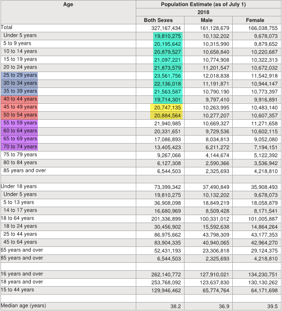
The colors on this July 2018 chart show the following:
Purple = Baby Boomer population 1944-1964 (Age 55 to 74)
Red = Gen X population 1965-1979 (Age 40 to 54)
Blue = Millennials 1980-1994 (Age 25 to 39)
None Highlighted = Gen Z 1995-2015 (Age 3 to 24)
The important part of this chart from an investing or business standpoint is the yellow and green highlighted numbers of the chart which shows the amount of people in each of the categories by age. If the highest discretionary spending years are ages forty-five to fifty-five on average you can see the amount of people currently in the yellow spending zone, and then the amounts of people in the green zone behind them. From the looks of the numbers it isn’t going to slow down anytime soon pending any Black Swan type events that will disrupt things for short periods of time. From the numbers shown above there’s another forty-five years of consistent population coming forward from today on this census list.