
Here are a few economic charts that provide perspective on the economy and markets. There are no surprises here. The charts just affirm what’s happening. Remember charts tell what has happened and not what is going to happen. Most of these charts are available at longtermtrends.net.
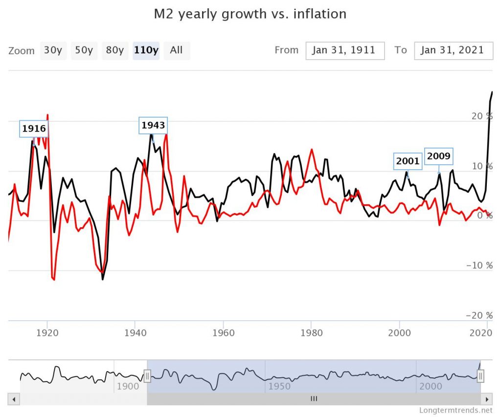
This first chart is the current liquid money supply versus CPI inflation rate change over the last 110 years. The M2 (black line & includes M1) represents physical cash and deposits plus savings currently in circulation within the US. The inflation rate (red line) is the yearly change in the CPI rate. This chart is a clear example of what the Fed is trying to do. You can see in most instances the red line tends to follow the black line. If your business is getting busy this explains much of it. Cheap money. Cost or materials increases are next which eventually transition into higher payrolls and more spending.
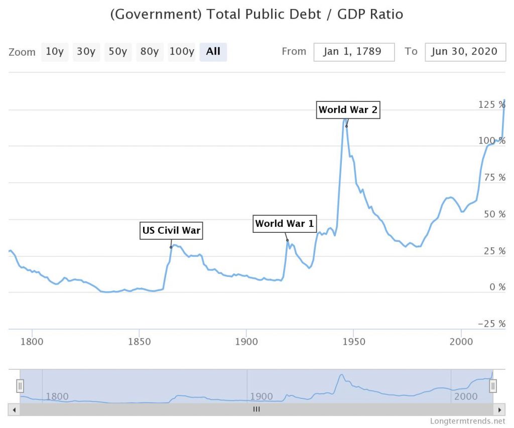
This chart shows the current US debt throughout history. The price of trying to repair the economy with stimulus. This chart is a head scratcher. Highest amount of debt we’ve ever had as compared to GDP.
Government Economy Debt
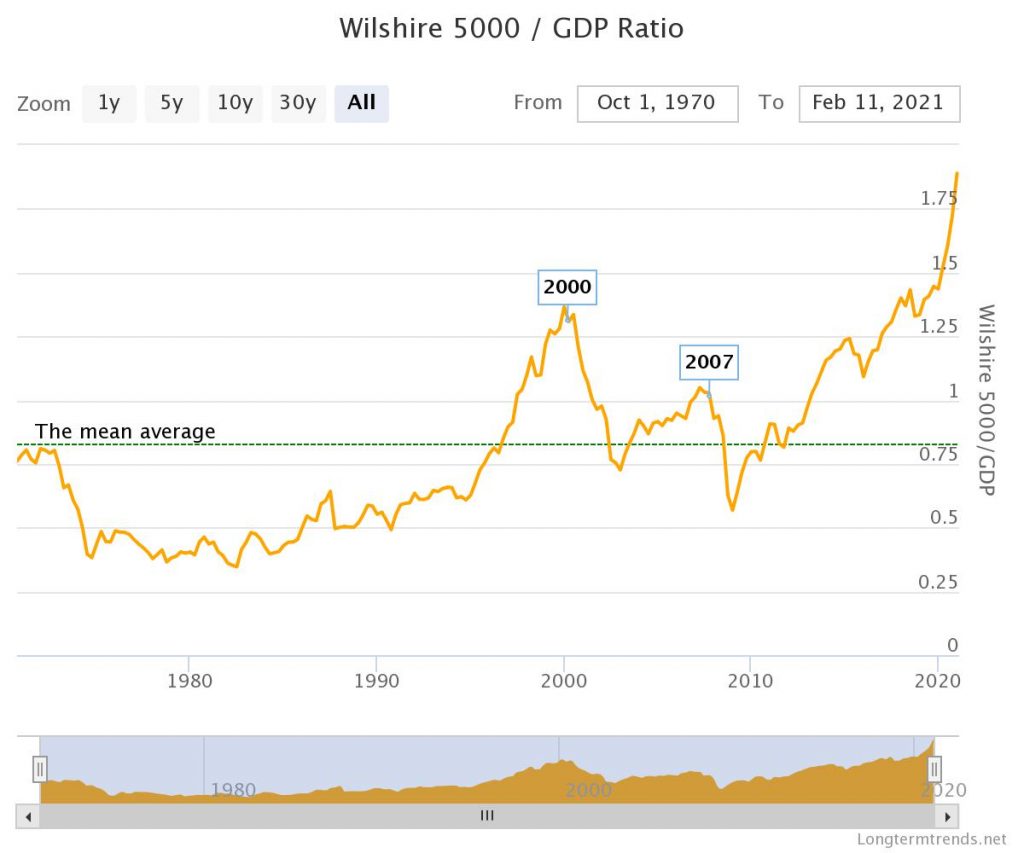
The next chart is considered the Buffett indicator. It’s a comparison of the Wilshire 5000 market capitalization versus the GDP. Historically readings above 1 have been considered cautionary. Keep in mind that current monetary policy is unique than that of twenty plus years ago, so this is probably why this indicator hasn’t worked as well.
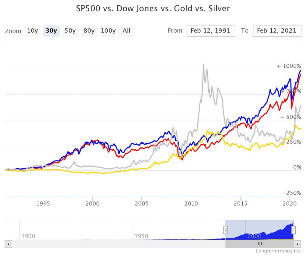
This chart shows gold versus the S&P 500 and Dow Jones Averages over the last 30 years. The S&P 500 and Dow Jones are the red and blue lines. Gold is the yellow line, and silver the grey line. Reading about a lot of gold bugs becoming bitcoin bugs these days.
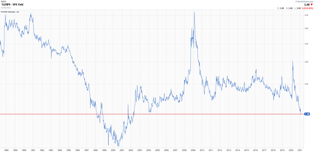
The last chart is a chart I created. It shows the S&P 500 dividend yield over the last 32 plus years. As you can see by the red line on the chart the current yield has only been lower than the red line for approximately four years out of the total chart years. This represents about 14% of the total, or inverted it says that 86% of the time over the last thirty-two years the dividend yield for the S&P 500 has been above where it is today. If you look at the lowest point where the dividend yield bottomed on this chart it was during the dot.com bubble. Hence, current stock valuations feel familiar to the past.
Keep in mind that these are charts and they don’t predict anything going forward with the economy. Clearly, the Fed has some work to do, and how they will balance all of this will be interesting to see. Interest rates have already started coming off of the bottom at the consumer level. The Fed is going to keep their rates fixed for now which means banks, financials, or anything that makes money off of consumer interest rates are going to have fatter profit margins as consumer rates rise. Consumer rates’ upward trend will obviously be driven by consumer spending and unemployment. It remains to be seen how fast this will occur.
If you’re interested in investment help contact us here.